The Galaxy S6: A Design Revolution
The Samsung Galaxy S6 marked a significant departure from the design language of previous Galaxy smartphones. This wasn’t just a cosmetic change; it reflected Samsung’s evolving design philosophy and their desire to compete with the sleek and premium aesthetics of Apple’s iPhone.
The Galaxy S6’s design was a departure from the plastic construction of its predecessors, embracing a more premium and sophisticated look. Here’s a breakdown of the key design elements that set the Galaxy S6 apart:
- Glass and Metal Construction: The Galaxy S6 ditched the plastic casing for a combination of Corning Gorilla Glass 4 on the front and back, and a durable aluminum frame. This not only enhanced the phone’s durability but also gave it a sleek, premium look and feel.
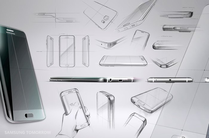
- Curved Edges: The Galaxy S6 featured a 2.5D curved glass display, which extended beyond the aluminum frame. This not only enhanced the visual appeal but also made the phone feel more comfortable to hold. The curved edges also allowed for a more seamless transition between the display and the frame.
- Slim Profile: The Galaxy S6 was remarkably thin, measuring just 6.8mm in thickness. This slim profile contributed to the phone’s elegant appearance and made it easier to carry in a pocket.
- Symmetrical Design: The Galaxy S6 had a symmetrical design, with the camera lens and the flash positioned symmetrically on the rear panel. This symmetrical arrangement contributed to the phone’s balanced and harmonious aesthetics.
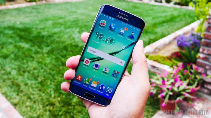
- Color Palette: Samsung offered the Galaxy S6 in a range of colors, including White Pearl, Black Sapphire, Gold Platinum, and Blue Topaz. These colors were carefully selected to enhance the phone’s premium look and appeal to a wider range of users.
Reflecting Samsung’s Evolving Design Philosophy
The Galaxy S6’s design reflected a shift in Samsung’s design philosophy. The company was moving away from its focus on functional design and embracing a more premium and aesthetically driven approach. This shift was evident in the use of high-quality materials, the focus on symmetry and balance, and the attention to detail in the phone’s overall design.
Design Inspirations
The Galaxy S6’s design drew inspiration from several sources. The use of glass and metal was a nod to the design language of Apple’s iPhone, which had set the benchmark for premium smartphone design. The curved edges of the display were inspired by the design of Samsung’s own Galaxy Note Edge, which had introduced the concept of curved displays.
“We wanted to create a phone that felt as good in your hand as it looked. We spent a lot of time researching the best materials and design elements to create a truly premium experience.” – A Samsung Design Executive
Material and Craftsmanship
The Galaxy S6 marked a significant shift in Samsung’s design philosophy, moving away from plastic construction towards a more premium and sophisticated aesthetic. The company embraced high-quality materials, particularly glass and metal, to create a device that felt luxurious and durable.
The Galaxy S6’s design was not just about aesthetics; it was about creating a seamless and intuitive user experience. The choice of materials played a crucial role in achieving this.
The Use of Glass and Metal
The Galaxy S6’s design incorporates Corning Gorilla Glass 4 on both the front and back, creating a smooth and elegant surface. The sides of the phone are crafted from a durable and refined aluminum frame, adding to the phone’s premium feel.
- The use of glass enhances the phone’s visual appeal, providing a sleek and modern look.
- The glass surface allows for vibrant and clear display colors, enhancing the overall user experience.
- The aluminum frame provides structural integrity and a solid grip, making the phone feel more robust.
- The combination of glass and metal creates a premium and luxurious feel, setting the Galaxy S6 apart from previous models.
The Impact on Aesthetics and User Experience
The Galaxy S6’s material choices contribute significantly to its premium feel and aesthetics. The smooth glass surfaces and the sleek aluminum frame create a visually appealing and tactile experience.
- The glass back, while elegant, can be prone to scratches and fingerprints, requiring careful handling.
- The use of metal in the frame provides a robust and sturdy feel, enhancing the phone’s durability.
- The combination of glass and metal creates a visually striking and aesthetically pleasing design, enhancing the phone’s premium feel.
Comparison to Previous Samsung Models
The Galaxy S6’s design marked a significant departure from previous Samsung models, which primarily used plastic construction. The shift to glass and metal represented a conscious effort to elevate the phone’s design and create a more premium and sophisticated user experience.
- The use of glass and metal in the Galaxy S6’s design was a significant departure from previous Samsung models, which primarily used plastic construction.
- The Galaxy S6’s design was a clear indication of Samsung’s commitment to creating a more premium and sophisticated user experience.
- The use of high-quality materials like glass and metal not only enhanced the phone’s aesthetics but also contributed to its durability and robustness.
Form Factor and Ergonomics
The Galaxy S6’s form factor and ergonomics played a crucial role in its user experience. Samsung carefully crafted the phone’s design, considering factors like grip, weight distribution, and button placement, to ensure a comfortable and intuitive user experience.
Form Factor
The Galaxy S6’s form factor, with its sleek, symmetrical design and curved edges, was a significant departure from previous Galaxy S models. This new design aimed to provide a more comfortable grip and a more premium look and feel. The phone’s slim profile and rounded corners made it easy to hold and maneuver, even for users with smaller hands. However, some users found the phone’s smooth glass back to be slippery, making it prone to accidental drops.
Ergonomics
The Galaxy S6’s ergonomics were designed to enhance user comfort and usability. The phone’s weight distribution was balanced, preventing fatigue during prolonged use. The buttons, including the power button and volume rocker, were strategically placed on the right side of the phone, making them easily accessible with the thumb. The home button, located on the front of the phone, served as a fingerprint sensor, adding another layer of security and convenience.
User Feedback
User feedback on the Galaxy S6’s form factor and ergonomics was generally positive. Many users praised the phone’s sleek design, comfortable grip, and well-placed buttons. Some users found the phone’s glass back to be slippery, but overall, the majority of users appreciated the phone’s ergonomic design.
Design Features and Functionality
The Galaxy S6’s design wasn’t just about aesthetics; it was about seamlessly integrating form and function. Samsung meticulously crafted every element to enhance user experience, making the phone both beautiful and practical.
The Curved Edges: A New Era of Ergonomics
The Galaxy S6’s curved edges were a bold departure from the flat, rectangular designs that dominated the smartphone market. This design choice wasn’t just about aesthetics; it significantly improved the phone’s ergonomics. The curved edges provided a more comfortable grip, reducing the risk of accidental drops. This design feature made the phone feel more natural in the hand, enhancing the overall user experience.
The Home Button: A Touch of Innovation
The Galaxy S6’s home button was more than just a physical button; it was a fingerprint sensor. This innovation transformed the way users interacted with their phone. The fingerprint sensor provided an extra layer of security, allowing users to unlock their phone quickly and easily with a single touch. This feature also enhanced the phone’s overall functionality, allowing users to access various features, such as Samsung Pay, with just a fingerprint scan.
The Camera Module: Capturing Memories with Clarity
The Galaxy S6’s camera module was designed to capture stunning photos and videos. The camera lens was positioned flush with the phone’s body, eliminating the camera bump that was common on other smartphones at the time. This design choice not only improved the phone’s aesthetics but also enhanced its functionality. The flush camera lens made it easier to place the phone on a flat surface without wobbling, making it easier to capture stable shots.
Comparison with Contemporaries: A Standout Design
The Galaxy S6’s design was a breath of fresh air compared to other smartphones released around the same time. Many phones at the time still featured flat, rectangular designs with protruding camera modules. The Galaxy S6’s curved edges, integrated fingerprint sensor, and flush camera lens set it apart from the competition, establishing it as a leader in smartphone design.
The Galaxy S6 marked a turning point for Samsung’s design philosophy, setting a new standard for the brand’s smartphones and influencing the design of subsequent models. Its sleek, premium aesthetic and focus on craftsmanship ushered in a new era for Samsung, leaving a lasting impact on the smartphone landscape.
Key Design Elements Carried Forward
The Galaxy S6’s design innovations were not simply a one-time occurrence; they became the foundation for future Samsung smartphones. Several key design elements from the Galaxy S6 were carried forward and refined in subsequent models, demonstrating the enduring influence of its design philosophy.
- Glass and Metal Construction: The Galaxy S6’s premium glass and metal construction became a defining characteristic of Samsung’s flagship lineup. This material combination not only enhanced the aesthetic appeal but also provided a more robust and durable build quality, elevating the overall user experience.
- Curved Display: The Galaxy S6 Edge introduced the curved display, a feature that became a signature element of Samsung’s high-end smartphones. This innovative design not only enhanced the visual appeal but also provided additional functionality, such as edge-based notifications and shortcuts.
- Simplified Design Language: The Galaxy S6’s design was characterized by a minimalist aesthetic and clean lines, a departure from the more cluttered design language of previous Samsung smartphones. This simplified design approach was adopted in subsequent models, creating a more cohesive and elegant visual identity for the brand.
- Focus on Functionality: The Galaxy S6’s design was not solely focused on aesthetics; it also emphasized functionality. The placement of buttons, the size and shape of the display, and the overall ergonomics were meticulously considered to optimize user experience. This emphasis on functionality became a cornerstone of Samsung’s design philosophy, ensuring that its smartphones were not only beautiful but also practical.
Samsung shares design philosophy behind the galaxy s6 – The Galaxy S6’s design legacy is undeniable. Its sleek aesthetic, premium materials, and focus on ergonomics set a new standard for Samsung smartphones, influencing the design of countless devices that followed. The Galaxy S6 was a testament to Samsung’s ability to innovate and adapt, demonstrating a commitment to creating devices that are both visually appealing and functionally exceptional. This smartphone remains a landmark in the evolution of Samsung’s design language, paving the way for a new era of premium and sophisticated smartphones.
Samsung’s design philosophy behind the Galaxy S6, focusing on premium materials and a sleek aesthetic, seems to have inspired a new wave of modular design. Check out this Lego computer case that’s basically modular and futureproof , proving that even tech can be built with a playful, customizable approach. It’s a reminder that the future of design might just be about building on the past, with a dash of creative freedom thrown in for good measure.
 Standi Techno News

